Confluence Health is the largest healthcare provider serving North Central Washington. As a graphic designer with the marketing team I was tasked with designing a variety of on-brand print design projects in support of departmental marketing and communication goals. Products included logos, brochures, postcards, posters, presentations, publications, and more.
Optical Care Services
Marketing Materials
Marketing Materials
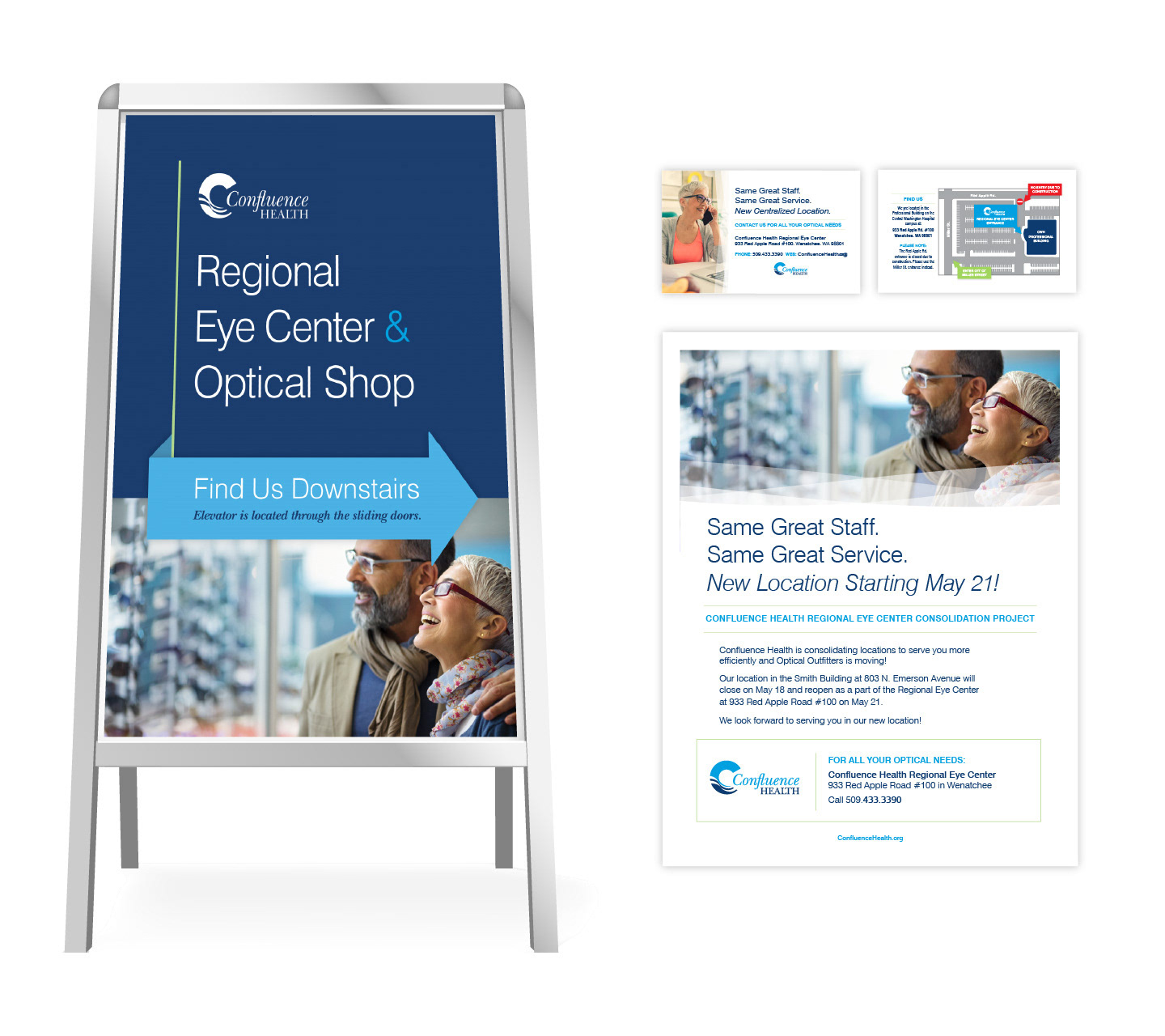
Optical care services were centralized to a single location and a mix of marketing materials were needed to communicate the changes to patients both before and after the move. The resulting designs gave the new regional eye center a cohesive look with a light and modern feel to help encourage a positive response to the new service model.
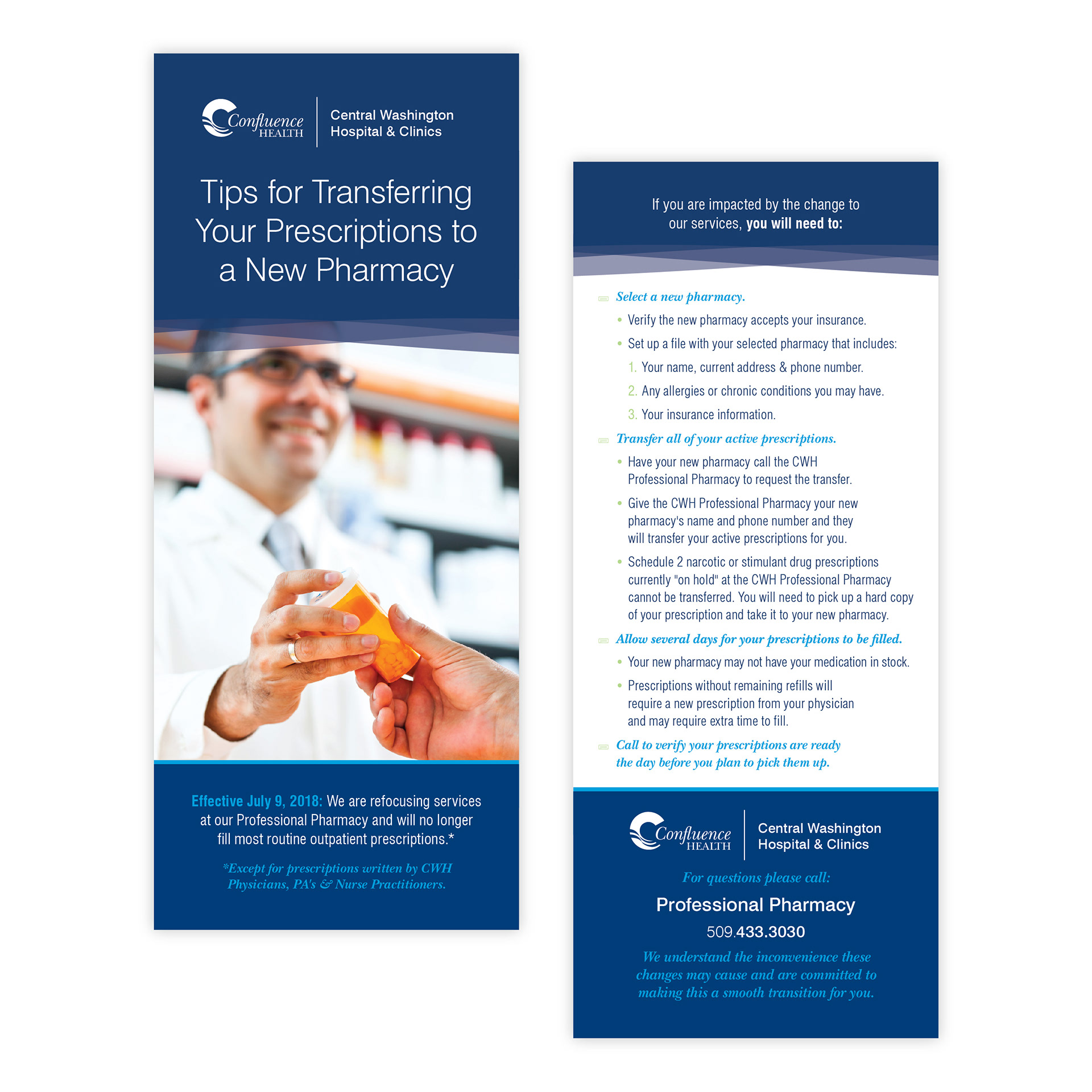
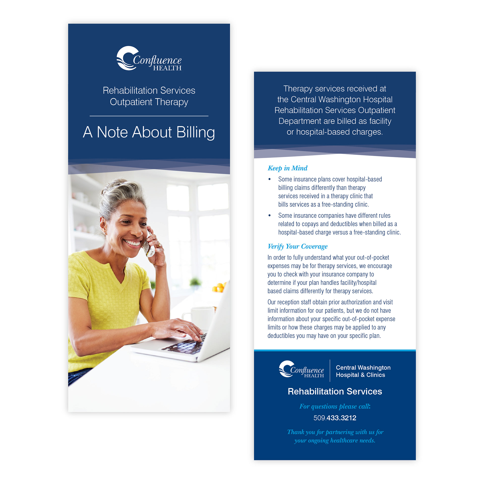
various rack cards
A sampling of rack cards developed in support of various departmental communication needs.

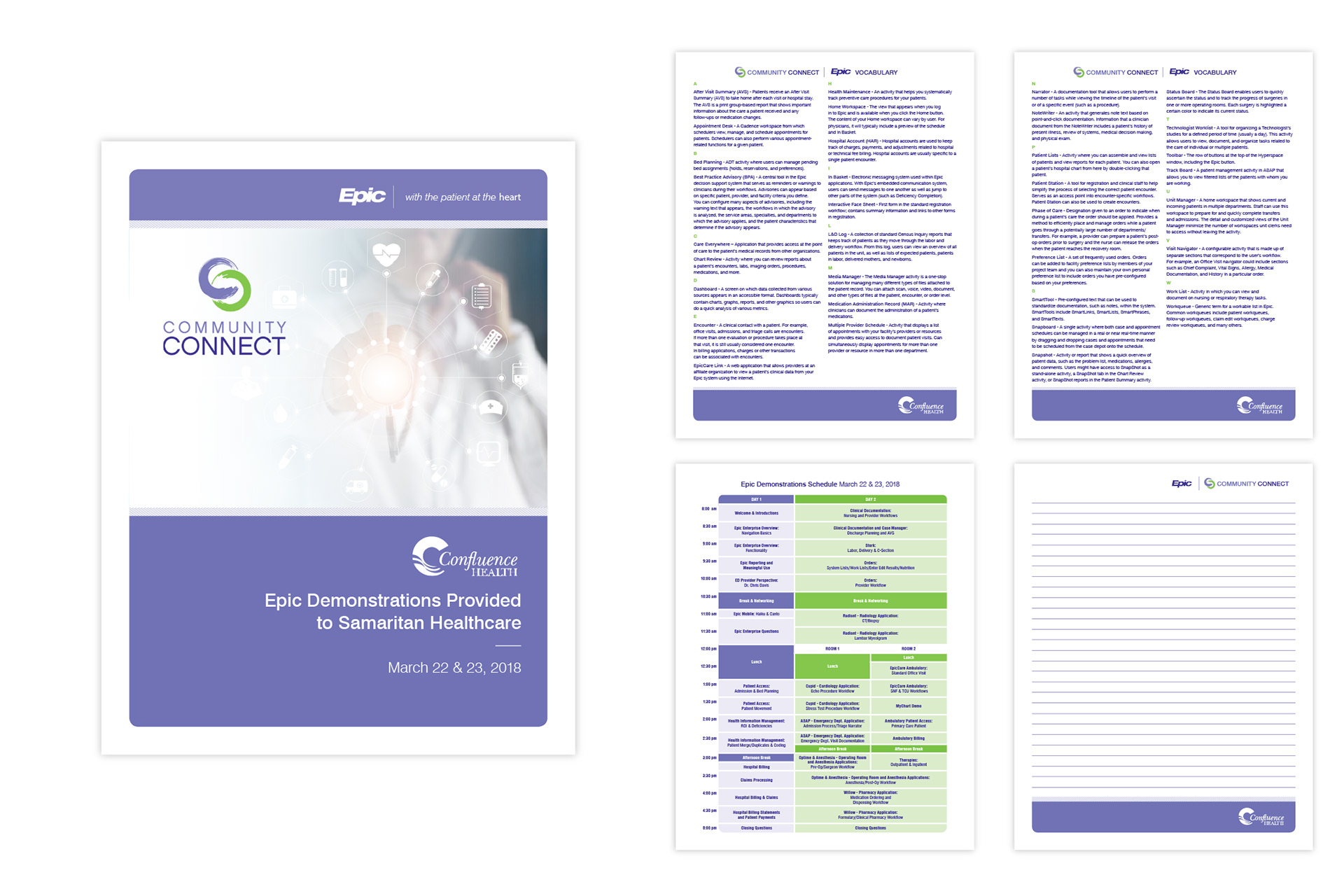
Epic Community Connect
The following bifold flyer with glossary insert was used to demonstrate the value of the Epic healthcare software with other rural healthcare providers.
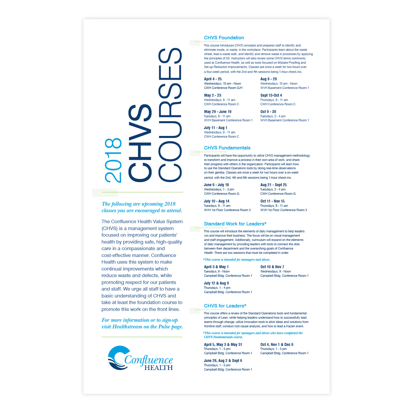
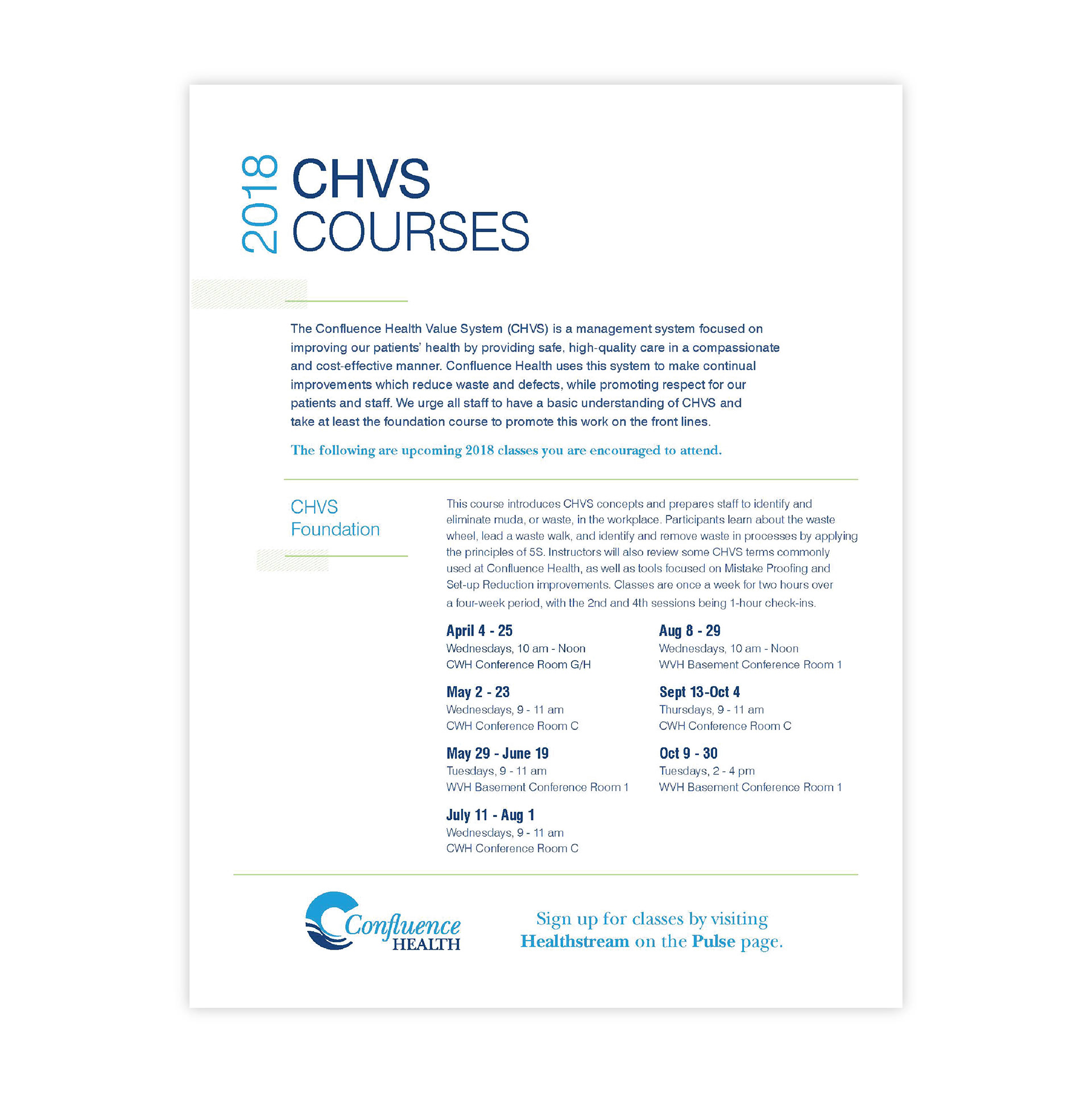
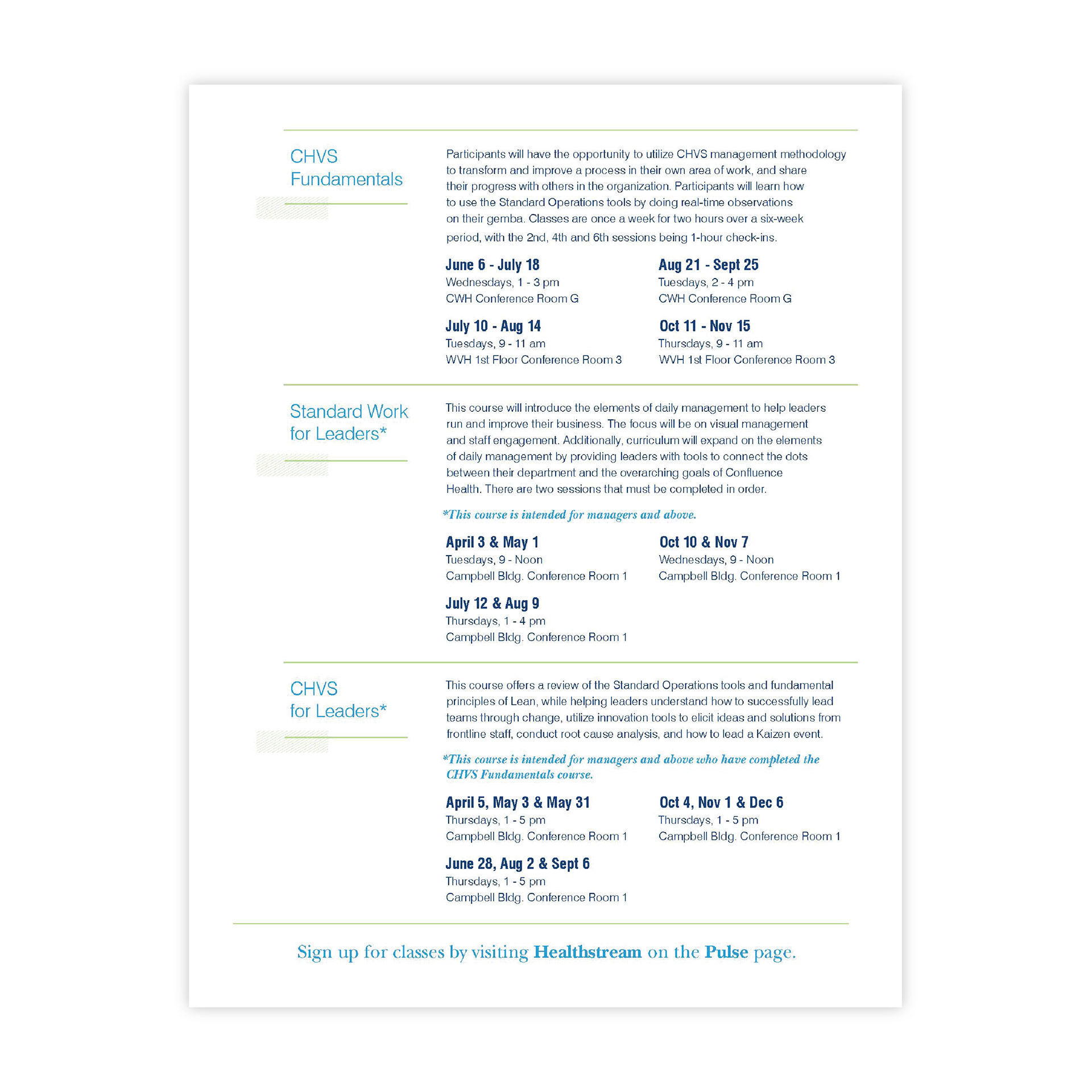
Confluence Health Value System
marketing materials
marketing materials
The Confluence Health Value System, or CHVS, is a series of leadership development courses offered to employees. I worked to infuse a little on-brand style into an otherwise typographically heavy poster and handout used to internally advertise the courses.
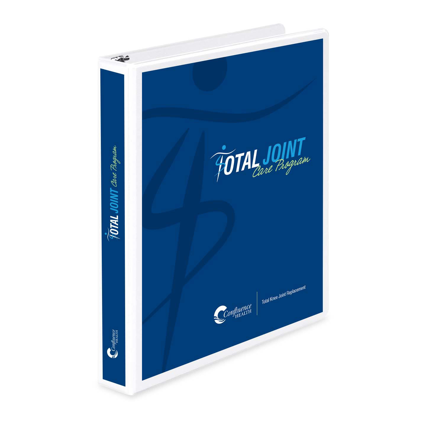
Total Joint Care Program
A new care program was launched to "prepare, engage, and empower patients undergoing total joint replacement." I was tasked with developing a logo, poster, PowerPoint presentation and corresponding 60+ page patient manual to help guide patients through their joint replacement experience from preoperative preparations to recovery. The result is an enlivening, on-brand solution and valuable patient resource.

catch me!
internal recognition program
internal recognition program
Catch Me! is an internal recognition program for employees, medical staff members and volunteers. The original tri-fold brochure was outdated and a redesign was required to bring it up to date and meet the current branding guidelines. The redesign breathes new life into the piece with a playful design and supporting superhero theme that catches the eye, encourages participation, clarifies the purpose and process of the program, and supports their overall branding efforts.